Writing · 11 September 2021
Responsive Images Without JavaScript
How to have responsive images on your site, leveraging a simple HTML element, without the need for JavaScript or server-side code.

The cover image for this post is by Paul Skorupskas
This blog post was written by Jamie.
Introduction
You read that right:
WITHOUT using JavaScript
A Little History
I started working professionally in web development shortly after websites had abandoned using the Wireless Application Protocol
or WAP
Typically, a website owner would create a wap.<whateverdomain>.<tld> websites for users on mobile phones. This was great, because it allowed us web developers to pick and choose the content that we could display on the mobile phone, because (99% of the time) it would be mobile phone users accessing the website.
When that fell out of favour, it became the in vogue thing to have a mobile subdomain and redirect users there. This was the same idea, but you didn’t need extra server infrastructure just for the mobile site. In fact, WikiPedia still offer this. By heading to https://en.m.wikipedia.org/wiki/Main_Page, you’ll get the mobile friendly version of the home page for the English version of WikiPedia.
Then game Responsive web design. This was a whole new ball-game. It was a way of designing a website, it’s assets, and stylesheets (CSS) such that the website could respond to the size of the view port that the user’s web browser has. So a website which was loaded on a desktop computer could look different to one which was loaded on a mobile phone or a tablet, for instance.
This was a huge boon to the industry, and is still in use to this day.
Then web developers started thinking about the size of the images that they were loading into the browser.
It will take longer to load an image which is 1600x800 pixels on a mobile phone, and the browser will have to resize that dynamically, once loaded. A huge wast of bandwidth and CPU time on the end device
And so, the idea of using details about the view port to figure out which image to load was born.
The idea with this was to use information about the browser which was requesting the page in order to guess which versions of images to display. If the user was on a phone, then the browser would somehow load smaller images than if the user was on a desktop computer.
This was originally done using JavaScript and some user agent string queries. Which lead to increased CPU time and privacy concerns.
And it worked for a while. But then HTML5 came along with it’s <picture> element.
The img Element
When you want to display an image in an HTML document, you will typically use the <img> element. This is pretty straight-forward and trivial (for most web developers) to use. Here’s an example:
<img
    class="any-css-classes-you-want"
    src="a/url/for/the/image.jpg"
    alt="A well written and detailed description of what the image contains">
In the above code block, we have declared an <img> element with three attributes:
classwhich contains a list of CSS classes we want to apply to the elementsrcwhich is either an absolute or relative path to the image we want to displayaltwhich contains a description of the image
NOTE:
The alt attribute isn’t required in order for the image to be displayed, but is incredibly useful to have for users with accessibility concerns. The value of this attribute can be used by screen readers or similar applications to increase the accessibility of your content.
And this works great if you only want to display one image, regardless of the view port in use.
But what if you want to serve a different image on smaller screens?
The picture Element
This is where HTML5 and CSS3 come to the rescue, as they bring with them the <picture> element.
Among other things, the <picture> element provides a way of supplying a number of different source sets. These source sets are sets of images which will be displayed under certain conditions.
Let’s take a look at an example of a <picture> element:
<picture>
    <source
        srcset="/path/to/a.webp"
        type="image/webp"
        media="(min-width: 1200px)">
    <source
        srcset="/path/to/a/large.jpg"
        media="(min-width: 1200px)">
    <source
        srcset="/path/to/a/medium.jpg"
        media="(min-width: 800px)">
    <source
        srcset="/path/to/a/small.jpg"
        media="(min-width: 340px)">
    <img
        class="any-css-classes-you-want"
        src="/path/to/a/small.jpg"
        alt="A well written and detailed description of what the image contains">
</picture>
What we have here is a <picture> element with a number of child <source> elements and an <img> element. In the above code example, the <image> element is laid out as it was before, so let’s take a look at the attributes of one of the <source> elements. We have:
srcsetwhich has a path to one of the images to displaytypewhich is an optional attribute. This helps the browser to figure out what the file type is, and whether it supports it. More on this in a momentmediawhich is a CSS3 media query. You may be more familiar with these in your CSS files
The type attribute is completely optional, and assists the browser in deciding whether the <source> attribute can be rendered. This is similar to the <type> attribute in the HTML5 <video> element
which you can read about here
The expected value of the <type> attribute is a valid MIME type for the image. If an invalid MIME type is supplied, or one which the browser does not support, then the <source> element is ignored.
In the above examples, we have four <source> elements and an <img> element, but if you included this in an HTML document only one image will display. Why?
the <picture> element is really rather clever. Here’s what happens:
- The browser sees the
<picture>element and starts parsing through any<source>elements that it can find - The browser picks the
<source>element which matches on both support for thetypeattribute, and themediaattribute.
Only then is the value of the matching srcset used, and the image referenced there is requested. This means that only one image is requested, even though there are five listed in the example. The requested image is then rendered in the page as if it were in the child <img> element included in the <picture> element
which ensures that the CSS classes are applied, and the atl text is supplied
If none of the <source> attributes are relevant or supported by the browser, then it will fall back to using the <img> element.
A Real Example
We recently started working on a website for a Hull-based tradesman. He requested several pages with image galleries, and the first version of the page looked like the following image:
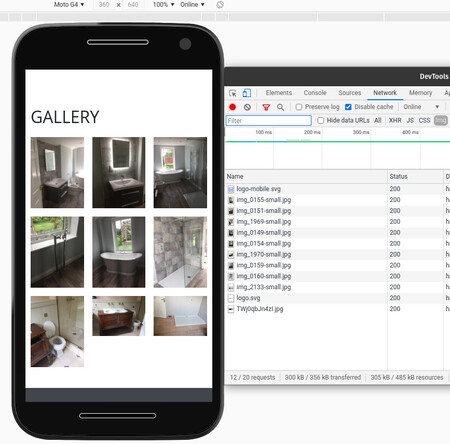
The above image shows a mobile phone view of the webpage, all of the images which have been loaded into the page, and the network requests which have been made in order to get those images (shown in the developer tools on the right-hand side of the image).
As you can see from the developer tools, only the requests for the small versions of the images have been made. But when we inspect the HTML, each of the <picture> elements lists all of the possibilities for the browser to choose from:
<picture>
    <source
        srcset="/services/bathroom-fittings/img_0155.webp"
        type="image/webp"
        media="(min-width: 1200px)">
    <source
        srcset="/services/bathroom-fittings/img_0155.jpg"
        media="(min-width: 1200px)">
    <source
        srcset="/services/bathroom-fittings/img_0155-medium.jpg"
        media="(min-width: 800px)">
    <source
        srcset="/services/bathroom-fittings/img_0155-small.jpg"
        media="(min-width: 340px)">
    <img
        src="/services/bathroom-fittings/img_0155-small.jpg"
        alt="A custom fitted bathroom in sleek a modern style. There is a mirror mounted above a basin and cupboard unit, the mirror is mounted such that it protrudes from the wall by 2 inches. There is also a toilet visible to the right of the basin and cupboard unit. And the door to the bathroom is visible and open on the left-hand side of the image">
</picture>
A Note About webp
webp is a relatively new image format, created by Google which provides smaller filesizes for images in both losseless and lossy compression when compared to png (losseless) and jpg (lossy) formats, respectively.
Using webp is not a requirement of modern web development but since images encoded in it are smaller, pages which have webp images rather than jpg images have the ability to load and display faster. This is dependant on a number of factors, not least of which include:
- Server speed; if your server is slow, then the page will render slowly
- Support for webp; if the browser does not support webp, then an
<img>element which uses it will not work- This is why I prefer to use the
<picture>element, as the browser can pick the source that it supports
- This is why I prefer to use the
You can read more about the webp format here.
Browser Support
As with everything in the web development world, whether you can use the <picture> element comes down to whether the web browsers of your users support it. As the <picture> element was included in the HTML5 and CSS3 timelines, not all browsers support it. But the situation is getting better. The following is a (truncated) screenshot from the caniuse.com page for the <picture> element:
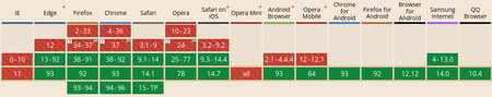
As you can see from the above image
taken on September 11th, 2021
there are a few web browsers which do not support the <picture> element. These include:
- All versions of Internet Explorer
- Versions of Edge prior to 13
i.e. before it was rebased to use Chromium
- Early versions of Chrome, Firefox, Safari, Opera
- All versions of Opera Mini
- Early versions of the Android browser and Opera Mobile
The decision of whether to use the <picture> element is one which should be taken with the above points in mind. If your users are not using a supported web browser, then perhaps you should not use it. Definitely check the caniuse.com page to find out which browsers support the <picture> element before using it.
In Summary
Modern web browsers now support a way to load an image from a set of image sources, which match on custom media queries or file type support. This is provided in the <picture> element, which has one or more child <source> elements, and a fallback <img> element. Only the image source which is relevant to the browser (through file type support) and that matches the supplied media query will be requested from the remote server, or that of the <img> element if none of the <source> elements are relevant.
The <picture> element isn’t supported by every web browser, but most of the modern ones support it. The decision of whether to use it or not should be down to whether your users are using the unsupported web browsers or not.
Use of the <picture> element alongside the modern webp image format can help to decrease page loading times whilst also adhering to the principles of responsive web design.
And don’t forget to fill in that alt attribute on your images, as it will help users with accessibility concerns. Just make sure to make it a useful description.